An outdoor kitchen sits between house and garden. Get the colour story right and everything feels intentional, calm and expensive. Get it wrong and the terrace looks bolted on. Colour choices also affect maintenance and safety. Mid tones hide grime better than very light or very dark surfaces, and warm hues often feel comfortable in a cool Essex climate.
Below are tried and tested palettes for common Essex façades. Each palette lists paving, cabinetry or masonry, worktop, metals, timber and planting accents so you can build a coherent scheme from house wall to herb pot.
1. RED OR RUSSET BRICK
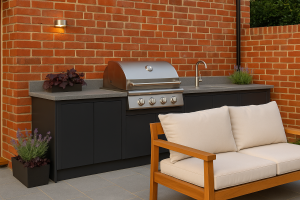
Mood: warm, timeless, family friendly.
Paving: light to mid grey porcelain with a gentle texture. Greys calm the warmth of red brick without fighting it.
Cabinetry or masonry: charcoal or very deep graphite for a grounded base.
Worktop: mid grey sintered stone with fine salt-and-pepper grain.
Metals: brushed stainless or pewter. Highly polished chrome can feel cold against red brick.
Timber: honey or teak tones, oiled rather than stained dark.
Planting accents: deep greens with burgundy foliage, such as heuchera, and soft purple flowers like nepeta or lavender.
Lighting temperature: warm white around 2700–3000 K so brick glows rather than looks orange.
Why it works: cool greys balance warm brick, charcoal adds depth, timber and planting bridge house and garden.
2. BUFF OR YELLOW BRICK
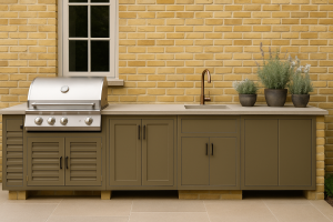
Mood: sunny and light, can look washed out if paired with very pale finishes.
Paving: warm mid greys or pale taupe porcelain rather than white.
Cabinetry or masonry: olive grey or warm clay.
Worktop: biscuit to mushroom tone in a matte finish.
Metals: bronze, antique brass or smoked stainless.
Timber: oak or light ash tones.
Planting accents: silvery herbs, white flowers, soft blue catmint to cool the yellow.
Why it works: a touch of warmth in the hardscape prevents a clinical feel, bronze metals add richness without glare.
3. DARK BRICK
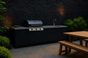
Mood: dramatic, architectural.
Paving: mid silver grey or pale limestone-look porcelain for contrast and safe night-time visibility.
Cabinetry or masonry: soot, near black or dark olive for depth.
Worktop: pale concrete-look sintered stone to avoid a black hole effect.
Metals: black powder coat with brushed stainless highlights.
Timber: pale oak or thermally modified ash to lift the scheme.
Planting accents: lime greens and chartreuse to pop against dark walls.
Why it works: high contrast keeps the space legible, pale worktops and timber prevent the terrace from feeling heavy.
4. SANDSTONE OR MIXED NATURAL STONE
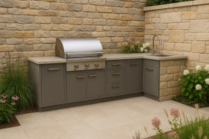
Mood: rustic to refined depending on the mix.
Paving: porcelain that echoes the stone’s lightest tone, never a close but imperfect match.
Cabinetry or masonry: warm grey or flint.
Worktop: mid greige with subtle movement.
Metals: galvanised or aged zinc feel honest beside stone.
Timber: weathered oak tones.
Planting accents: soft pinks, whites and grasses for movement.
Why it works: repeating undertones across materials creates harmony while porcelain provides durability and slip resistance.
5. LIMESTONE OR PALE STONE
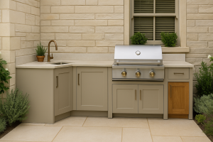
Mood: airy, classic, can feel cold in winter light.
Paving: light greige porcelain with a warm cast rather than blue grey.
Cabinetry or masonry: clay, putty or mushroom.
Worktop: creamy limestone-look sintered stone, matte finish.
Metals: brass or aged bronze to warm the scene.
Timber: mid oak.
Planting accents: deep greens, white roses, thyme, sage.
Why it works: gentle warmth keeps pale stone from feeling chilly, bronze details add character.
6. SLATE, FLINT OR CONTEMPORARY STONE
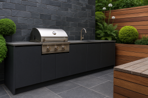
Mood: cool, sleek, graphic.
Paving: mid to dark grey porcelain with a fine texture.
Cabinetry or masonry: charcoal or blue grey.
Worktop: near black or very dark graphite, honed not polished.
Metals: black powder coat and stainless combined.
Timber: cedar left to silver.
Planting accents: architectural evergreens, ferns, white alliums for crisp points of light.
Why it works: a restrained monochrome palette looks deliberate, silvered timber softens the hard edges.
7. WHITE OR OFF-WHITE RENDER
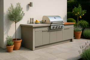
Mood: bright, crisp, reveals any mismatch fast.
Paving: soft mid grey to anchor the space.
Cabinetry or masonry: pebble grey or stone.
Worktop: pale concrete-look that is easy to wipe.
Metals: stainless or pale nickel.
Timber: warm teak or iroko for contrast.
Planting accents: olive greens, herbs, citrus pots where microclimate allows.
Why it works: mid tones prevent glare and hide day-to-day marks better than white slabs.
8. CREAM OR PARCHMENT
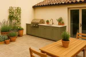
Mood: warm Mediterranean notes.
Paving: warm taupe porcelain or travertine-look porcelain with slip rating for outdoors.
Cabinetry or masonry: olive, sage or clay.
Worktop: light almond or pale travertine-look sintered stone.
Metals: brass or bronze.
Timber: rich teak.
Planting accents: rosemary, lavender, white jasmine, terracotta pots.
Why it works: earthy greens and bronzes echo sun-baked landscapes while staying practical in UK light.
9. MID TO DARK GREY
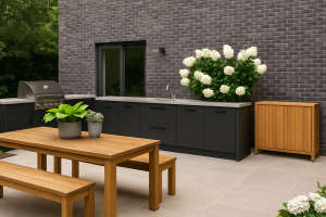
Mood: modern, can look flat if everything else is grey.
Paving: pale silver or light greige to lift the elevation.
Cabinetry or masonry: deep charcoal for definition.
Worktop: pale concrete-look to create contrast.
Metals: black powder coat.
Timber: pale to mid oak for warmth.
Planting accents: lime hostas, silver plectranthus, white hydrangeas.
Why it works: contrast and timber prevent the all-grey trap.
10. BLACK TIMBER CLADDING
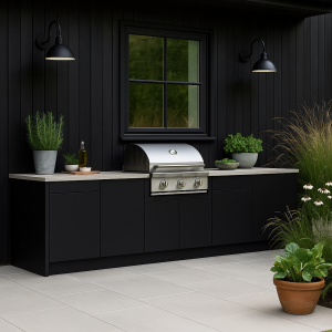
Mood: Nordic, bold, photogenic.
Paving: pale grey or buff porcelain for legibility.
Cabinetry or masonry: black to match cladding or deep green for a softer take.
Worktop: pale stone look to reflect light.
Metals: black with touches of stainless.
Timber: pale ash or birch tones.
Planting accents: feathery grasses, white flowers, edible greens.
Why it works: light hardscape and worktops keep the area bright, planting softens the stark backdrop.
A strong colour story starts with the house, not the grill. Pick tones that complement your brick, stone or render, keep surfaces in practical mid ranges, and use metals and timber as small notes that tie the whole picture together. When the palette is coherent, the outdoor kitchen looks like it has always belonged, and you will enjoy it in every season.